


")
Post by RockHard on Apr 5, 2016 1:19:25 GMT -5
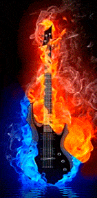
If you like my slick fire guitar slideshow, here's the code for it.
First the javascript that goes between the head tags. This is used only for the left/right images slideshow part of scheme & timed to change every 32 seconds where you see the # 32000 then it's delayed 24 seconds from starting where you see 24000. You can adjust it to whatever your needs are.
Most of the images are using css keyframe codes. If you endevour to play around with this to build something you could use, the biggest headache is getting all the images timed to run with a coordinated logic. Also got this up on codepen if you want to play with it there @ link
<head>
<script src="https://code.jquery.com/jquery-2.1.3.min.js"></script>

<script>
function cycleBackgrounds() {
  var index = 0;
  $slideShows = $('.slideshow');
  $imageEls = $('.toggle-image');

  setInterval(function() {
    index = index + 1 < ($imageEls.length / 2) ? index + 1 : 0;
    $slideShows.each(function() {
      $(this).children('.toggle-image').eq(index).addClass('show');
      $(this).children('.toggle-image').eq(index - 1).removeClass('show');
    });
  }, 32000);
};

$(function() {
    window.setTimeout(cycleBackgrounds, 24000);
})
</script>
</head>
Here's the html code that's doing this elaborate slideshow with spin & fade effects using a table to house it all. It's pretty complicated & a miracle I was able to find all the needed codes then patch them together & tweek it into what it is. Hope you have fun building something you could use from this project but you'll likely need to be pretty advanced in coding to deal with something this elaborate, I'm not that advanced & amazed I was able to pull this off.
Note: be sure to remove my <--notes--> you see along the way describing what the codes do or functions.
Copy & paste these codes to a test template so you can get a less congested view of it than it is here but if you run it, it likely won't have spacing between elements like what's seen on my page. Proboards uses an odd default line spacing code somewhere that I had to compensate for to get it all lined up so you may need to adjust spacing codes somewhere to pull it all together neatly.
<div class="blockstyle">
<table><tr>
<td class="td1" rowspan="3"><!--[if gte IE 9]><!-->
<span class="spinner">
<div class="slideshow">
<div class="slide"><!--<![endif]-->
<img src="http://storage.proboards.com/6436879/i/nTX2JFuPTiAPbYytSKge.gif" width="104px" height="219px" />
</div><!--[if gte IE 9]><!-->
<div class="background-image toggle-image first-image show"></div>
<div class="background-image toggle-image second-image"></div>
<div class="background-image toggle-image third-image"></div>
<div class="background-image toggle-image fourth-image"></div>
<div class="background-image toggle-image fifth-image"></div>
<div class="background-image toggle-image sixth-image"></div>
<div class="background-image toggle-image seventh-image"></div>
<div class="background-image toggle-image eighth-image"></div>
<div class="background-image toggle-image nineth-image"></div>
<div class="background-image toggle-image tenth-image"></div>
<div class="background-image toggle-image eleventh-image"></div>
<div class="background-image toggle-image twelfth-image"></div>
<div class="background-image toggle-image thirteenth-image"></div>
<div class="background-image toggle-image forteenth-image"></div><!--<![endif]-->
</div></span>
</td>

<td class="td3">
<span class="shrink1" style="display:inline-block;box-shadow:0 0 18px 2px #1F6C1A">
<img src="http://storage.proboards.com/6436879/i/pgUKmqMSyA8J4D4vQN5e.gif" width="116px" height="48px" />
</span>
</td>

<td class="td5"><div class="shrink2">
<span class="flick"><span class="neon3">You've entered the audio zone, lair of...</span></span></div>
</td>
<td class="td4">
<span class="shrink1" style="display:inline-block;box-shadow:0 0 18px 2px #1F6C1A">
<img src="http://storage.proboards.com/6436879/i/pgUKmqMSyA8J4D4vQN5e.gif" width="116px" height="48px" />
</span>
</td>

<td class="td2" rowspan="3"><!--[if gte IE 9]><!-->
<span class="spinner">
<div class="slideshow">
<div class="slide2"><!--<![endif]-->
<img src="http://storage.proboards.com/6436879/i/Ej31UFQahhL6CZvv9aEX.gif" width="104px" height="219px" />
</div><!--[if gte IE 9]><!-->
<div class="background-image toggle-image first-image show"></div>
<div class="background-image toggle-image second-image"></div>
<div class="background-image toggle-image third-image"></div>
<div class="background-image toggle-image fourth-image"></div>
<div class="background-image toggle-image fifth-image"></div>
<div class="background-image toggle-image sixth-image"></div>
<div class="background-image toggle-image seventh-image"></div>
<div class="background-image toggle-image eighth-image"></div>
<div class="background-image toggle-image nineth-image"></div>
<div class="background-image toggle-image tenth-image"></div>
<div class="background-image toggle-image eleventh-image"></div>
<div class="background-image toggle-image twelfth-image"></div>
<div class="background-image toggle-image thirteenth-image"></div>
<div class="background-image toggle-image forteenth-image"></div><!--<![endif]-->
</div></span>
</td>
</tr>

<tr>
<td class="td6"><!--[if gte IE 9]><!-->
<span class="shrink1">
<!--[if gte IE 9]><!--><div class="slideshow3">
<!--[if gte IE 9]><!--><div class="slide3"><!--<![endif]-->
<img class="shrink1" src="http://storage.proboards.com/6436879/i/vvYJOToJYRQoDIOG5KiQ.gif" width="118px" height="80px" /></div>
<!--[if gte IE 9]><!-->
<div class="slideshow4">
<div class="slide4">
<div class="imgch">
<div class="shrink1"><img src="http://storage.proboards.com/6436879/i/nGxV8lkLHzqunZDb1XS8.gif" width="118px" height="80px">
<img class="top" src="http://storage.proboards.com/6436879/i/lmvBjvuObOaBrdDJVE_V.gif" width="118px" height="80px"></div>
</div>
<div class="slideshow5">
<div class="slide5">
<img src="http://storage.proboards.com/6436879/i/fr89QUBYj2_vfQlbXX54.gif" width="118px" height="80px"></div>
</div></div></div></div></span><!--<![endif]-->
</td>

<td class="td8"><div class="shrink2"><!--[if gte IE 9]><!-->
<div class="slideshow6">
<div class="slide6"><!--<![endif]-->
<div class="remaster">~ Custom Remastered HD Audio ~</div></div>
<!--[if gte IE 9]><!--><div class="slideshow6a">
<div class="slide7">
<div class="slid7a"><div class="move"><img class="shrink2" src="http://storage.proboards.com/6436879/i/kP99qNtTHcR3DK8uVBza.gif" width="367px" height="43px"></div></div>
<div class="slid7b"><div class="move2"><img class="shrink2" src="http://storage.proboards.com/6436879/i/NdP2TJUeTYLgTcjSbphK.png" width="369px" height="59px"></div></div>
</div></div></div></div><!--<![endif]-->
</td>

<td class="td7"><!--[if gte IE 9]><!-->
<span class="shrink1">
<div class="slideshow3">
<div class="slide3"><!--<![endif]-->
<img class="shrink1" src="http://storage.proboards.com/6436879/i/vvYJOToJYRQoDIOG5KiQ.gif" width="118px" height="80px"></div>
<!--[if gte IE 9]><!-->
<div class="slideshow3a">
<div class="slide3a">
<div class="imgch">
<div class="shrink1"><img src="http://storage.proboards.com/6436879/i/eqb7NXHmvvkoceFyugSH.gif" width="118px" height="80px">
<img class="top" src="http://storage.proboards.com/6436879/i/lmvBjvuObOaBrdDJVE_V.gif" width="118px" height="80px"></div>
</div>
<div class="slideshow5">
<div class="slide5">
<img src="http://storage.proboards.com/6436879/i/iJ_kkplX4BG59zR3CY8U.gif" width="118px" height="80px"></div>
</div></div></div></div></span><!--<![endif]--></td>
</tr>

<tr>
<td class="td9" colspan="3">
<div class="shrink2">
<span class="color2">Audio freaks... a venue for you to show off what you can do with sound.</span>
</div>
</td>
</tr>
</table>
</div>
Here's the css for this with explanations to help understand what's getting done by them. Many parts of this are repeating the same css codes so be aware that even tho I show duplicate css codes to help show what's going on, only 1 instance is needed in your css sheet, duplicates will be noted along the way.
1st call to the css is for the styling of the table block.

.blockstyle {
background-image:url(http://storage.proboards.com/6436879/i/y_2tt0A8YLhpAvjuvSPC.gif);
background-color:#000000;
text-align:center;
display:inline-block;
box-shadow:0 0 9px 7px #000;
border:3px solid #2C261D;
border:4px solid #2C261D\9;
border-radius:4px;
padding:1px;
}

2nd css call is the table cell for left guitar image border, background & alignment.

.td1 { background:#000000;border-right:2px solid#1F1B15;padding-right:2px;padding-left:3px }

3rd css call is for spinning both flaming guitars with the code to hide all special effects from IE9 & lower which isn't capable of rendering them.

@keyframes spinner {
from {
-webkit-transform: rotateY(0deg);
-ms-transform: rotateY(0deg);
transform: rotateY(0deg);
}
to {
-webkit-transform: rotateY(360deg);
-ms-transform: rotateY(360deg);
transform: rotateY(360deg);
}}

.spinner { display: block;
-webkit-animation-name: spinner;
-ms-animation-name: spinner;
animation-name: spinner;
-webkit-animation-timing-function: ease-in-out;
-ms-animation-timing-function: ease-in-out;
animation-timing-function: ease-in-out;
-webkit-animation-iteration-count: 7;
-ms-animation-iteration-count: 7;
animation-iteration-count: 7;
-webkit-animation-duration: .8s;
-ms-animation-duration: .8s;
animation-duration: .8s;
-webkit-transform-style: preserve-3d;
-ms-transform-style: preserve-3d;
transform-style: preserve-3d;
-webkit-animation-delay: 22s;
-ms-animation-delay: 22s;
animation-delay: 22s;
}

4th & 5th css call is for the left flaming guitar slider. Note: The right flaming guitar slider has a reverse direction & the .slide part of this code will get amended for the right guitar further down as slide2.

.slideshow {
width: 104px;
height: 219px;
overflow: hidden;
position: relative;
}

.slida, .slidb, {
position: absolute;
width:104px;
height:219px;
}

.slida {left: 0;}
.slidb {left: 104px;}

.slide {
width: 104px;
height: 219px;
left:0;
position: absolute;
-webkit-animation-name: slide;
-webkit-animation-duration: 64s;
-webkit-animation-iteration-count:infinite;
-moz-animation-name: slide;
-moz-animation-duration: 64s;
-ms-animation-name: slide;
-moz-animation-iteration-count:infinite;
-ms-animation-duration: 64s;
-ms-animation-iteration-count:infinite;
-ms-animation-name: slide;
animation-name: slide;
animation-duration: 64s;
animation-iteration-count:infinite;
-webkit-animation-delay: 21s;
-ms-animation-delay: 21s;
animation-delay: 21s;
}

@-webkit-keyframes slide {
0% {left:0;}
18% {left:0;}
19% {left:-105px;}
30% {left:-105px;}
31% {left:0;}
69% {left:0;}
70% {left:105px;}
81% {left:105px;}
82% {left:0;}
100% {left:0;}
}

@-moz-keyframes slide {
 0% {left:0;}
18% {left:0;}
19% {left:-105px;}
30% {left:-105px;}
31% {left:0;}
69% {left:0;}
70% {left:105px;}
81% {left:105px;}
82% {left:0;}
100% {left:0;}
}

@-ms-keyframes slide {
0% {left:0;}
18% {left:0;}
19% {left:-105px;}
30% {left:-105px;}
31% {left:0;}
69% {left:0;}
70% {left:105px;}
81% {left:105px;}
82% {left:0;}
100% {left:0;}
}

@keyframes slide {
0% {left:0;}
18% {left:0;}
19% {left:-105px;}
30% {left:-105px;}
31% {left:0;}
69% {left:0;}
70% {left:105px;}
81% {left:105px;}
82% {left:0;}
100% {left:0;}
}

6th css call is for cycling the images behind the left fire guitar slide image & used again for the right side.

/* Styles for the alternating / transition effect. */

.toggle-image {
position:absolute;
width:100%;
top:0;
left:0;
height:219px;
transition:opacity 1s ease-in-out;
}

/* Styles for the specific images. */

.first-image {
background-image:url('http://storage.proboards.com/6436879/i/OnbqZlQ3gFJiWdOuHzI9.png');
background-size:104px 219px;
z-index:-1;
opacity:0;
}
.second-image {
background-image:url('http://storage.proboards.com/6436879/i/XH2lyfHujqh0G4kuDKjo.gif');
background-size:104px 219px;
z-index:-1;
opacity:0;
}
.third-image {
background-image:url('http://storage.proboards.com/6436879/i/NZPFFQ8uamqYIAsPPeVO.gif');
background-size:104px 219px;
z-index:-1;
opacity:0;
}
.fourth-image {
background-image:url('http://storage.proboards.com/6436879/i/3TlzocJbGVhWrPUFbkt8.jpg');
background-size:104px 219px;
z-index:-1;
opacity:0;
}
.fifth-image {
background-image:url('http://storage.proboards.com/6436879/i/CtlwalzopmtObuokxTGk.gif');
background-size:104px 219px;
z-index:-1;
opacity:0;
}
.sixth-image {
background-image:url('http://storage.proboards.com/6436879/i/M_UNFPQFpoaFcseKC8Ti.gif');
background-size:104px 219px;
z-index:-1;
opacity:0;
}
.seventh-image {
background-image:url('http://storage.proboards.com/6436879/i/0Ph0syFUKUK6gGyNGjkv.gif');
background-size:104px 219px;
z-index:-1;
opacity:0;
}
.eighth-image {
background-image:url('http://storage.proboards.com/6436879/i/QnlVIWCiG9PI8pmESlgv.gif');
background-size:104px 219px;
z-index:-1;
opacity:0;
}
.nineth-image {
background-image:url('http://storage.proboards.com/6436879/i/8OyuT3s8wjv6ULlbcR6n.gif');
background-size:104px 219px;
z-index:-1;
opacity:0;
}
.tenth-image {
background-image:url('http://storage.proboards.com/6436879/i/vQ3wrsrqKjBYycrVNrna.gif');
background-size:104px 219px;
z-index:-1;
opacity:0;
}
.eleventh-image {
background-image:url('http://storage.proboards.com/6436879/i/OQSfW7ML5KFjgDWMmyGP.gif');
background-size:104px 219px;
z-index:-1;
opacity:0;
}
.twelfth-image {
background-image:url('http://storage.proboards.com/6436879/i/O64HaT9PreTTj4yLEw3J.gif');
background-size:104px 219px;
z-index:-1;
opacity:0;
}
.thirteenth-image {
background-image:url('http://storage.proboards.com/6436879/i/jCddnH2MjTL1aPMnAKce.png');
background-size:104px 219px;
z-index:-1;
opacity:0;
}

.first-image.show {
opacity:1;
}
.second-image.show {
opacity:1;
}
.third-image.show {
opacity:1;
}
.fourth-image.show {
opacity:1;
}
.fifth-image.show {
opacity:1;
}
.sixth-image.show {
opacity:1;
}
.seventh-image.show {
opacity:1;
}
.eighth-image.show {
opacity:1;
}
.nineth-image.show {
opacity:1;
}
.tenth-image.show {
opacity:1;
}
.eleventh-image.show {
opacity:1;
}
.twelfth-image.show {
opacity:1;
}
.thirteenth-image.show {
opacity:1;
}

7th css call is for the table cell padding or alignment of the left signal image.

.td3 { padding-left:10px;padding-top:16px }

8th css call is for the shrink & return of the left signal image & shown in several other places on down but only needs to be used 1 time in the css.

.shrink1 {
transform-origin: center;
-webkit-animation-duration: 2.2s;
-ms-animation-duration: 2.2s;
animation-duration: 2.2s;
-webkit-animation-name: fadeAndScale;
-ms-animation-name: fadeAndScale;
animation-name: fadeAndScale;
-webkit-animation-timing-function: cubic-bezier(.09,0,.62,1);
-ms-animation-timing-function: cubic-bezier(.09,0,.62,1);
animation-timing-function: cubic-bezier(.09,0,.62,1);
-webkit-animation-delay: 16.3s;
-ms-animation-delay:16.3s;
animation-delay: 16.3s;
}

@keyframes fadeAndScale {
from {
opacity: 1;
transform: scale(.1, .1);
}
to {
opacity: 1;
transform: scale(1, 1);
}}

9th css call is for the for the top center glowing, flickering, text padding & alignment.

.td5 { padding-left:9px;padding-right:9px;padding-top:10px }

10th css call is for the above mentioned shrink & return.

.shrink1 {
transform-origin: center;
-webkit-animation-duration: 2.2s;
-ms-animation-duration: 2.2s;
animation-duration: 2.2s;
-webkit-animation-name: fadeAndScale;
-ms-animation-name: fadeAndScale;
animation-name: fadeAndScale;
-webkit-animation-timing-function: cubic-bezier(.09,0,.62,1);
-ms-animation-timing-function: cubic-bezier(.09,0,.62,1);
animation-timing-function: cubic-bezier(.09,0,.62,1);
-webkit-animation-delay: 16.3s;
-ms-animation-delay:16.3s;
animation-delay: 16.3s;
}

@keyframes fadeAndScale {
from {
opacity: 1;
transform: scale(.1, .1);
}
to {
opacity: 1;
transform: scale(1, 1);
}}

11th & 12th css calls is for the mentioned above neon & flicker effects.

span.neon3 {
margin-top:5px;
color:#000000;
font-family:franklin gothic medium;
font-size:19px;
font-weight:bold;
font-style:italic;
text-align:center;
text-shadow:1px 1px 1px #d5d5d5,
0 0 5px #C3FFB8,
0 0 6px #C3FFB8,
0 0 7px #C3FFB8,
0 0 8px #C3FFB8,
0 0 9px #C3FFB8,
0 0 10px #C3FFB8,
0 0 11px #C3FFB8,
0 0 12px #C3FFB8,
0 0 13px #C3FFB8,
0 0 14px #C3FFB8,
0 0 15px #C3FFB8,
0 0 16px #C3FFB8,
0 0 17px #C3FFB8,
0 0 18px #AFFFA0,
0 0 19px #AFFFA0,
0 0 20px #AFFFA0,
0 0 21px #AFFFA0,
0 0 22px #AFFFA0,
0 0 23px #AFFFA0,
0 0 24px #1B9500,
0 0 24px #1B9500,
0 0 24px #1B9500,
0 0 24px #1B9500,
0 0 24px #1B9500,
0 0 24px #1B9500,
0 0 25px #1B9500,
0 0 26px #1B9500,
0 0 27px #1B9500
}

.flick {
-webkit-animation: flick-anim 4s linear infinite;
-ms-animation: flick-anim 4s linear infinite;
animation: flick-anim 4s linear infinite;
}

@-webkit-keyframes flick-anim {
0%, 12%, 29%,  30%, 33%,  34%, 37%,  37%, 40%,  40%, 43%,  43%, 46%,  46%, 49%,  49%, 52%, 100%  {
opacity: 1
}
22%, 28%,  31%, 32%,  35%, 36%,  38%, 39%,  41%, 42%,  44%, 45%,  47%, 48%,  50%, 51% {
opacity: 0.75
}}

@-ms-keyframes flick-anim {
0%, 12%, 29%,  30%, 33%,  34%, 37%,  37%, 40%,  40%, 43%,  43%, 46%,  46%, 49%,  49%, 52%, 100%  {
opacity: 1
}
22%, 28%,  31%, 32%,  35%, 36%,  38%, 39%,  41%, 42%,  44%, 45%,  47%, 48%,  50%, 51% {
opacity: 0.75
}}

@keyframes flick-anim {
0%, 12%, 29%,  30%, 33%,  34%, 37%,  37%, 40%,  40%, 43%,  43%, 46%,  46%, 49%,  49%, 52%, 100%  {
opacity: 1
}
22%, 28%,  31%, 32%,  35%, 36%,  38%, 39%,  41%, 42%,  44%, 45%,  47%, 48%,  50%, 51% {
opacity: 0.75
}}

13th css call is for padding & alignment of the right signal image.

.td4 { padding-right:10px;padding-top:16px }

14th css call is for the shrink & return of the right signal image which is a repeated code that doesn't need to be added again to the css.

.shrink1 {
transform-origin: center;
-webkit-animation-duration: 2.2s;
-ms-animation-duration: 2.2s;
animation-duration: 2.2s;
-webkit-animation-name: fadeAndScale;
-ms-animation-name: fadeAndScale;
animation-name: fadeAndScale;
-webkit-animation-timing-function: cubic-bezier(.09,0,.62,1);
-ms-animation-timing-function: cubic-bezier(.09,0,.62,1);
animation-timing-function: cubic-bezier(.09,0,.62,1);
-webkit-animation-delay: 16.3s;
-ms-animation-delay:16.3s;
animation-delay: 16.3s;
}

@keyframes fadeAndScale {
from {
opacity: 1;
transform: scale(.1, .1);
}
to {
opacity: 1;
transform: scale(1, 1);
}}

15th css call is for the padding & alignment of the right flaming guitar slider.

.td2 { background:#000000;border-left:2px solid#1F1B15;padding-left:2px;padding-right:3px }

16th css call is for the flaming guitar spinner used already in the left side so this code doesn't need to be used again in the css.

@keyframes spinner {
from {
-webkit-transform: rotateY(0deg);
-ms-transform: rotateY(0deg);
transform: rotateY(0deg);
}
to {
-webkit-transform: rotateY(360deg);
-ms-transform: rotateY(360deg);
transform: rotateY(360deg);
}}

.spinner { display: block;
-webkit-animation-name: spinner;
-ms-animation-name: spinner;
animation-name: spinner;
-webkit-animation-timing-function: ease-in-out;
-ms-animation-timing-function: ease-in-out;
animation-timing-function: ease-in-out;
-webkit-animation-iteration-count: 7;
-ms-animation-iteration-count: 7;
animation-iteration-count: 7;
-webkit-animation-duration: .8s;
-ms-animation-duration: .8s;
animation-duration: .8s;
-webkit-transform-style: preserve-3d;
-ms-transform-style: preserve-3d;
transform-style: preserve-3d;
-webkit-animation-delay: 22s;
-ms-animation-delay: 22s;
animation-delay: 22s;
}

17th css call is for the the right flaming guitar slider that uses part of the left guitar slider code but amended with the following code that reverses the slide direction.

.slide2 {
width: 104px;
height: 219px;
left:0;
position: absolute;
-webkit-animation-name: slide2;
-webkit-animation-duration: 64s;
-webkit-animation-iteration-count:infinite;
-moz-animation-name: slide2;
-moz-animation-duration: 64s;
-moz-animation-iteration-count:infinite;
-ms-animation-name: slide2;
-ms-animation-duration: 64s;
-ms-animation-iteration-count:infinite;
animation-name: slide2;
animation-duration: 64s;
animation-iteration-count:infinite;
-webkit-animation-delay: 21s;
-ms-animation-delay: 21s;
animation-delay: 21s;
}

@-webkit-keyframes slide2 {
  0% {left:0;}
  18% {left:0;}
  19% {left:105px;}
  30% {left:105px;}
  31% {left:0;}
  69% {left:0;}
  70% {left:-105px;}
  81% {left:-105px;}
  82% {left:0;}
100% {left:0;}
}

@-moz-keyframes slide2 {
  0% {left:0;}
  18% {left:0;}
  19% {left:105px;}
  30% {left:105px;}
  31% {left:0;}
  69% {left:0;}
  70% {left:-105px;}
  81% {left:-105px;}
  82% {left:0;}
100% {left:0;}
}

@-ms-keyframes slide2 {
  0% {left:0;}
  18% {left:0;}
  19% {left:105px;}
  30% {left:105px;}
  31% {left:0;}
  69% {left:0;}
  70% {left:-105px;}
  81% {left:-105px;}
  82% {left:0;}
100% {left:0;}
}

@keyframes slide2 {
  0% {left:0;}
  18% {left:0;}
  19% {left:105px;}
  30% {left:105px;}
  31% {left:0;}
  69% {left:0;}
  70% {left:-105px;}
  81% {left:-105px;}
  82% {left:0;}
100% {left:0;}
}

The 18th css call is for the the rotating images under the flaming guitar. Refer back to css call #6 for the code. Not needed again for the css.

The next batch of code is for the 3 middle string of image sliders & rotators.

The 19th css call is for the padding & alignment of VU meter.

.td6 { padding-top:13px ;padding-left:10px;}

The 20th css call is for shrink & return of the images under the VU meter that is used previously & doesn't need repeating along with the IE 9 & lower code to hide the effects it can't render.

.shrink1 {
transform-origin: center;
-webkit-animation-duration: 2.2s;
-ms-animation-duration: 2.2s;
animation-duration: 2.2s;
-webkit-animation-name: fadeAndScale;
-ms-animation-name: fadeAndScale;
animation-name: fadeAndScale;
-webkit-animation-timing-function: cubic-bezier(.09,0,.62,1);
-ms-animation-timing-function: cubic-bezier(.09,0,.62,1);
animation-timing-function: cubic-bezier(.09,0,.62,1);
-webkit-animation-delay: 16.3s;
-ms-animation-delay:16.3s;
animation-delay: 16.3s;
}

@keyframes fadeAndScale {
from {
opacity: 1;
transform: scale(.1, .1);
}
to {
opacity: 1;
transform: scale(1, 1);
}}


The 21st & 22nd css calls are for the left VU meter slider which is same for the right VU & won't need again in this code.

.slideshow3 {
width:118px;z-index:1;
height:80px;
overflow: hidden;
position: relative;
}

.slid3a, .slid3b, {
position: absolute;z-index:1;
width:118px;
height:80px;
}

.slid3a{top: 0;}
.slid3b{top: 80px;}

.slide3 {
width: 118px;z-index:1;
height: 80px;
top:0;
position: absolute;
-webkit-animation-duration: 64s;
-webkit-animation-name: slide3;
-webkit-animation-iteration-count:infinite;
-moz-animation-name: slide3;
-moz-animation-duration: 64s;
-moz-animation-iteration-count:infinite;
-ms-animation-name: slide3;
-ms-animation-duration: 64s;
-ms-animation-iteration-count:infinite;
animation-name: slide3;
animation-duration: 64s;
animation-iteration-count:infinite;
-webkit-animation-delay: 35s;
-ms-animation-delay: 35s;
animation-delay: 35s;
}

@-webkit-keyframes slide3 {
0% {top:0;}
18% {top:0;}
19% {top:-80px;}
30% {top:-80px;}
31% {top:0;}
69% {top:0;}
70% {top:-80px;}
81% {top:-80px;}
82% {top:0;}
100% {top:0;}
}

@-moz-keyframes slide3 {
0% {top:0;}
18% {top:0;}
19% {top:-80px;}
30% {top:-80px;}
31% {top:0;}
69% {top:0;}
70% {top:-80px;}
81% {top:-80px;}
82% {top:0;}
100% {top:0;}
}

@-ms-keyframes slide3 {
0% {top:0;}
18% {top:0;}
19% {top:-80px;}
30% {top:-80px;}
31% {top:0;}
69% {top:0;}
70% {top:-80px;}
81% {top:-80px;}
82% {top:0px;}
100% {top:0;}
}

@keyframes slide3 {
0% {top:0;}
18% {top:0;}
19% {top:-80px;}
30% {top:-80px;}
31% {top:0;}
69% {top:0;}
70% {top:-80px;}
81% {top:-80px;}
82% {top:0;}
100% {top:0;}
}

The 23nd css call is for the left VU background images cycling & sync & shown again for the right VU but code is not needed again.

.imgch {
  position:relative;
  height:80px;
  width:118px;
  margin:0 auto;
}

.imgch img {
  position:absolute;
  left:0;bottom:0
}

.imgch .top {
  -webkit-animation-name: imgchFadeInOut;
  -webkit-animation-timing-function: ease-in-out;
  -webkit-animation-iteration-count: infinite;
  -webkit-animation-duration: 64s;
  -webkit-animation-direction: alternate;

  -moz-animation-name: imgchFadeInOut;
  -moz-animation-timing-function: ease-in-out;
  -moz-animation-iteration-count: infinite;
  -moz-animation-duration: 64s;
  -moz-animation-direction: alternate;

  -o-animation-name: imgchFadeInOut;
  -o-animation-timing-function: ease-in-out;
  -o-animation-iteration-count: infinite;
  -o-animation-duration: 64s;
  -o-animation-direction: alternate;

  animation-name: imgchFadeInOut;
  animation-timing-function: ease-in-out;
  animation-iteration-count: infinite;
  animation-duration: 64s;
  animation-direction: alternate;
}

@-webkit-keyframes imgchFadeInOut {
0% {
 opacity:1;
}
50% {
 opacity:1;
}
51% {
 opacity:0;
}
100% {
 opacity:0;
}}

@-moz-keyframes imgchFadeInOut {
0% {
 opacity:1;
 }
50% {
 opacity:1;
}
51% {
 opacity:0;
}
100% {
 opacity:0;
}}

@-o-keyframes imgchFadeInOut {
0% {
 opacity:1;
 }
50% {
 opacity:1;
}
51% {
 opacity:0;
}
100% {
 opacity:0;
}}

@keyframes imgchFadeInOut {
0% {
  opacity:1;
 }
 50% {
  opacity:1;
}
 51% {
  opacity:0;
}
 100% {
  opacity:0;
}}

The 24rd css call is for the shrink & return of the VU meter which is a repeated code & not needed again.

.shrink1 {
transform-origin: center;
-webkit-animation-duration: 3.5s;
-ms-animation-duration: 3.5s;
animation-duration: 3.5s;
-webkit-animation-name: fadeAndScale;
-ms-animation-name: fadeAndScale;
animation-name: fadeAndScale;
-webkit-animation-timing-function: cubic-bezier(.09,0,.62,1);
-ms-animation-timing-function: cubic-bezier(.09,0,.62,1);
animation-timing-function: cubic-bezier(.09,0,.62,1);
-webkit-animation-delay: 16.3s;
-ms-animation-delay:16.3s;
animation-delay: 16.3s;
}
@keyframes fadeAndScale {
from {
opacity: 1;
transform: scale(.1, .1);
}
to {
opacity: 1;
transform: scale(1, 1);
}}

The 25th & 26th css call is for the left VU slider.

.slideshow4 {
width:118px;z-index:0;
height:80px;
overflow: visible;
position: relative;
}
.slid4a, .slid4b, {
position: absolute;z-index:0;
width:118px;
height:80px;
}
.slid4a {top: 0;}
.slid4b{top: 80px;}

.slide4 {
width:118px;z-index:0;
height: 80px;
top:0;
position: absolute;
-webkit-animation-name: slide4;
-webkit-animation-duration: 64s;
-webkit-animation-iteration-count:infinite;
-moz-animation-name: slide4;
-moz-animation-duration: 64s;
-moz-animation-iteration-count:infinite;
-ms-animation-name: slide4;
-ms-animation-duration:64s;
-ms-animation-iteration-count:infinite;
animation-name: slide4;
animation-duration:64s;
animation-iteration-count:infinite;
-webkit-animation-delay: 26s;
-ms-animation-delay: 26s;
animation-delay: 26s;
animation-duration: 64s;
}

@-webkit-keyframes slide4 {
0% {top:0;}
49% {top:0;}
50% {top:-80px;}
100% {top:-80px;}
}
@-moz-keyframes slide4 {
0% {top:0;}
49% {top:0;}
50% {top:-80px;}
100% {top:-80px;}
}
@-ms-keyframes slide4 {
0% {top:0;}
49% {top:0;}
50% {top:-80px;}
100% {top:-80px;}
}
@keyframes slide4 {
0% {top:0;}
49% {top:0;}
50% {top:-80px;}
99% {top:-80px;}
}

The 27th css call is for the slide & sync of the VU background images & a repeated code that doesn't need repeating.

.slideshow4 {
width:118px;z-index:0;
height:80px;
overflow: visible;
position: relative;
}
.slid4a, .slid4b, {
position: absolute;z-index:0;
width:118px;
height:80px;
}
.slid4a {top: 0;}
.slid4b{top: 80px;}

.slide4 {
width:118px;z-index:0;
height: 80px;
top:0;
position: absolute;
-webkit-animation-name: slide4;
-webkit-animation-duration: 64s;
-webkit-animation-iteration-count:infinite;
-moz-animation-name: slide4;
-moz-animation-duration: 64s;
-moz-animation-iteration-count:infinite;
-ms-animation-name: slide4;
-ms-animation-duration:64s;
-ms-animation-iteration-count:infinite;
animation-name: slide4;
animation-duration:64s;
animation-iteration-count:infinite;
-webkit-animation-delay: 26s;
-ms-animation-delay: 26s;
animation-delay: 26s;
animation-duration: 64s;
}

@-webkit-keyframes slide4 {
0% {top:0;}
49% {top:0;}
50% {top:-80px;}
100% {top:-80px;}
}
@-moz-keyframes slide4 {
0% {top:0;}
49% {top:0;}
50% {top:-80px;}
100% {top:-80px;}
}
@-ms-keyframes slide4 {
0% {top:0;}
49% {top:0;}
50% {top:-80px;}
100% {top:-80px;}
}
@keyframes slide4 {
0% {top:0;}
49% {top:0;}
50% {top:-80px;}
99% {top:-80px;}
}

The 28th is for the custom remaster slideshow padding & alignment.

.td8 { padding-top:14px;padding-right:9px;padding-left:3px }

The 29th css call is for the shrink & return of the remaster field which is already in use & doesn't need repeating.

.shrink2 {
transform-origin: center;
-webkit-animation-duration: 2s;
-ms-animation-duration: 2s;
animation-duration: 2s;
-webkit-animation-name: fadeAndScale;
-ms-animation-name: fadeAndScale;
animation-name: fadeAndScale;
-webkit-animation-timing-function: cubic-bezier(.09,0,.62,1);
-ms-animation-timing-function: cubic-bezier(.09,0,.62,1);
animation-timing-function: cubic-bezier(.09,0,.62,1);
-webkit-animation-delay: 16.3s;
-ms-animation-delay:16.3s;
animation-delay: 16.3s;
}

@keyframes fadeAndScale {
from {
opacity: 1;
transform: scale(.1, .1);
}
to {
opacity: 1;
transform: scale(1, 1);
}}

The 28th css call is for sliding the custom remaster text area.

.slideshow6 {
width:369px;margin-left:6px;z-index:1;
height:58px;
overflow: hidden;
position: relative;
}

.slid6a, .slid6b, {
position: absolute;
z-index:1;
width:369px;
height:58px;
}

.slid6a {top: 0;}
.slid6b {top: 58px;}

.slide6 {
width: 369px;z-index:1;
height: 58px;
top:0;
position: absolute;
-webkit-animation-name: slide6;
-webkit-animation-duration: 64s;
-webkit-animation-iteration-count:infinite;
-ms-animation-name: slide6;
-moz-animation-duration: 64s;
-moz-animation-iteration-count:infinite;
-ms-animation-name: slide6;
-ms-animation-duration: 64s;
-ms-animation-iteration-count:infinite;
animation-name: slide6;
animation-duration: 64s;
animation-iteration-count:infinite;
-webkit-animation-delay: 35s;
-ms-animation-delay: 35s;
animation-delay: 35s;
}

@-webkit-keyframes slide6 {
0% {top:0;}
18% {top:0;}
19% {top:58px;}
30% {top:58px;}
31% {top:0;}
69% {top:0;}
70% {top:58px;}
81% {top:58px;}
82% {top:0;}
100% {top:0;}
}

@-moz-keyframes slide6 {
0% {top:0;}
18% {top:0;}
19% {top:58px;}
30% {top:58px;}
31% {top:0;}
69% {top:0;}
70% {top:58px;}
81% {top:58px;}
82% {top:0;}
100% {top:0;}
}

@-ms-keyframes slide6 {
0% {top:0;}
18% {top:0;}
19% {top:58px;}
30% {top:58px;}
31% {top:0;}
69% {top:0;}
70% {top:58px;}
81% {top:58px;}
82% {top:0;}
100% {top:0;}
}

@keyframes slide6 {
0% {top:0;}
18% {top:0;}
19% {top:58px;}
30% {top:58px;}
31% {top:0;}
69% {top:0;}
70% {top:58px;}
81% {top:58px;}
82% {top:0;}
100% {top:0;}
}

The 29th css call is for the custom remaster style & text.

.remaster {
-moz-box-shadow:inset 0 0 10px 1px #1a31ff;
-webkit-box-shadow:inset 0 0 10px 1px #1a31ff;
box-shadow:inset 0 0 10px 1px #1a31ff;
border-radius:5px;
display:inline-block;
background-color:#000000;
border:2px solid #0735ff;
border-bottom:3px solid #0735ff;
color:#4B8BFF;
font-family:palatino linotype;
font-size:22px;
font-weight:bold;
font-style:italic;
height:53px;
line-height:50px;
width:364px;
text-decoration:none;
text-align:center;
}

The 30th css call is for sliding the images behind the remaster.

.slideshow7 {
 width:368px;z-index:0;
 height:57px;
 overflow: visible;
 position: relative;
}

.slid7a, .slid7b, {
position: absolute;z-index:0;
width:368px;
height:58px;
}

.slid7a {top: 0;}
.slid7b {top: 58px;}

.slide7 {
width: 368px;z-index:0;
height: 58px;
top:0;
position: absolute;
-webkit-animation-name: slide7;
-webkit-animation-duration: 64s;
-webkit-animation-iteration-count:infinite;
-moz-animation-name: slide7;
-moz-animation-duration: 64s;
-moz-animation-iteration-count:infinite;
-ms-animation-name: slide7;
-ms-animation-duration:64s;
-ms-animation-iteration-count:infinite;
animation-name: slide7;
animation-duration:64s;
animation-iteration-count:infinite;
-webkit-animation-delay: 28s;
-ms-animation-delay: 28s;
animation-delay: 28s;
}

@-webkit-keyframes slide7 {
0% {top:0;}
49% {top:0;}
50% {top:-58px;}
100% {top:-58px;}
}
@-moz-keyframes slide7 {
0% {top:0;}
49% {top:0;}
50% {top:-58px;}
100% {top:-58px;}
}
@-ms-keyframes slide7 {
0% {top:0;}
49% {top:0;}
50% {top:-58px;}
100% {top:-58px;}
}
@keyframes slide7 {
0% {top:0;}
49% {top:0;}
50% {top:-58px;}
99% {top:-58px;}
}

The 31st, 32nd, 33rd & 34th css calls are for aligning the the custom remaster background images alignment & shrink & return of the custom remaster background images. Shrink is a repeat already used & not needed.

.move { margin-left:2px;margin-top:13px }
.move2 { margin-left:1px }

.shrink2 {
transform-origin: top;
-webkit-animation-duration: 3.5s;
-ms-animation-duration: 3.5s;
animation-duration: 3.5s;
-webkit-animation-name: fadeAndScale;
-ms-animation-name: fadeAndScale;
animation-name: fadeAndScale;
-webkit-animation-timing-function: cubic-bezier(.09,0,.62,1.2);
-ms-animation-timing-function: cubic-bezier(.09,0,.62,1.2);
animation-timing-function: cubic-bezier(.09,0,.62,1.2);
-webkit-animation-delay: 16.3s;
-ms-animation-delay: 16.3s;
animation-delay: 16.3s;
}

@keyframes fadeAndScale {
from {
opacity: 1;
transform: scale(.1, .1);
}
to {
opacity: 1;
transform: scale(1, 1);
}}

The 35tdhcss call is for the right VU slideshow padding & alignment.

.td7 { padding-top:13px;padding-right:10px }

The 36th css call is for the the shrink & return of the right VU meter background images which is a repeat code that's already used previously.

.shrink1 {
transform-origin: center;
-webkit-animation-duration: 2s;
-ms-animation-duration: 2s;
animation-duration: 2s;
-webkit-animation-name: fadeAndScale;
-ms-animation-name: fadeAndScale;
animation-name: fadeAndScale;
-webkit-animation-timing-function: cubic-bezier(.09,0,.62,1);
-ms-animation-timing-function: cubic-bezier(.09,0,.62,1);
animation-timing-function: cubic-bezier(.09,0,.62,1);
-webkit-animation-delay: 16.3s;
-ms-animation-delay:16.3s;
animation-delay: 16.3s;
}
@keyframes fadeAndScale {
from {
opacity: 1;
transform: scale(.1, .1);
}
to {
opacity: 1;
transform: scale(1, 1);
}}

The 37th css call is for the right VU slider which is previously used & not needed again.

.slideshow3 {
width:118px;z-index:1;
height:80px;
overflow: hidden;
position: relative;
}

.slid3a, .slid3b, {
position: absolute;z-index:1;
width:118px;
height:80px;
}

.slid3a{top: 0;}
.slid3b{top: 80px;}

.slide3 {
width: 118px;z-index:1;
height: 80px;
top:0;
position: absolute;
-webkit-animation-duration: 64s;
-webkit-animation-name: slide3;
-webkit-animation-iteration-count:infinite;
-moz-animation-name: slide3;
-moz-animation-duration: 64s;
-moz-animation-iteration-count:infinite;
-ms-animation-name: slide3;
-ms-animation-duration: 64s;
-ms-animation-iteration-count:infinite;
animation-name: slide3;
animation-duration: 64s;
animation-iteration-count:infinite;
-webkit-animation-delay: 35s;
-ms-animation-delay: 35s;
animation-delay: 35s;
}

@-webkit-keyframes slide3 {
0% {top:0;}
18% {top:0;}
19% {top:-80px;}
30% {top:-80px;}
31% {top:0;}
69% {top:0;}
70% {top:-80px;}
81% {top:-80px;}
82% {top:0;}
100% {top:0;}
}

@-moz-keyframes slide3 {
0% {top:0;}
18% {top:0;}
19% {top:-80px;}
30% {top:-80px;}
31% {top:0;}
69% {top:0;}
70% {top:-80px;}
81% {top:-80px;}
82% {top:0;}
100% {top:0;}
}

@-ms-keyframes slide3 {
0% {top:0;}
18% {top:0;}
19% {top:-80px;}
30% {top:-80px;}
31% {top:0;}
69% {top:0;}
70% {top:-80px;}
81% {top:-80px;}
82% {top:0px;}
100% {top:0;}
}

@keyframes slide3 {
0% {top:0;}
18% {top:0;}
19% {top:-80px;}
30% {top:-80px;}
31% {top:0;}
69% {top:0;}
70% {top:-80px;}
81% {top:-80px;}
82% {top:0;}
100% {top:0;}
}

The 38th css call is for the shrink & return of the VU meter, again a repeated code not needed.

.shrink1 {
transform-origin: center;
-webkit-animation-duration: 2s;
-ms-animation-duration: 2s;
animation-duration: 2s;
-webkit-animation-name: fadeAndScale;
-ms-animation-name: fadeAndScale;
animation-name: fadeAndScale;
-webkit-animation-timing-function: cubic-bezier(.09,0,.62,1);
-ms-animation-timing-function: cubic-bezier(.09,0,.62,1);
animation-timing-function: cubic-bezier(.09,0,.62,1);
-webkit-animation-delay: 16.3s;
-ms-animation-delay:16.3s;
animation-delay: 16.3s;
}
@keyframes fadeAndScale {
from {
opacity: 1;
transform: scale(.1, .1);
}
to {
opacity: 1;
transform: scale(1, 1);
}}

The 39th css call is for slideshow images behind the right VU.

.slideshow3a {
width:118px;z-index:0;
height:80px;
overflow: visible;
position: relative;
}
.slidr3a, .slidr3b, {
position: absolute;
z-index:0;
width:118px;
height:80px;
}
.slidr3a {top: 0;}
.slidr3b{top: 80px;}

.slide3a {
width:118px;z-index:0;
height: 80px;
top:0;
position: absolute;
-webkit-animation-name: slide3a;
-webkit-animation-duration: 64s;
-webkit-animation-iteration-count:infinite;
-moz-animation-name: slide3a;
-moz-animation-duration: 64s;
-moz-animation-iteration-count:infinite;
-ms-animation-name: slide3a;
-ms-animation-duration:64s;
-ms-animation-iteration-count:infinite;
animation-name: slide3a;
animation-duration:64s;
animation-iteration-count:infinite;
-webkit-animation-delay: 26s;
-ms-animation-delay: 26s;
animation-delay: 26s;
}

@-webkit-keyframes slide3a {
0% {top:0;}
49% {top:0;}
50% {top:-80px;}
100% {top:-80px;}
}
@-moz-keyframes slide3a {
0% {top:0;}
49% {top:0;}
50% {top:-80px;}
100% {top:-80px;}
}
@-ms-keyframes slide3a {
0% {top:0;}
49% {top:0;}
50% {top:-80px;}
100% {top:-80px;}
}
@keyframes slide3a {
0% {top:0;}
49% {top:0;}
50% {top:-80px;}
99% {top:-80px;}
}

The 40th css call is to cycle & sync the images behind the right VU & a repeated code not needed again.

.imgch {
  position:relative;
  height:80px;
  width:118px;
  margin:0 auto;
}

.imgch img {
  position:absolute;
  left:0;bottom:0
}

.imgch .top {
  -webkit-animation-name: imgchFadeInOut;
  -webkit-animation-timing-function: ease-in-out;
  -webkit-animation-iteration-count: infinite;
  -webkit-animation-duration: 64s;
  -webkit-animation-direction: alternate;

  -moz-animation-name: imgchFadeInOut;
  -moz-animation-timing-function: ease-in-out;
  -moz-animation-iteration-count: infinite;
  -moz-animation-duration: 64s;
  -moz-animation-direction: alternate;

  -o-animation-name: imgchFadeInOut;
  -o-animation-timing-function: ease-in-out;
  -o-animation-iteration-count: infinite;
  -o-animation-duration: 64s;
  -o-animation-direction: alternate;

  animation-name: imgchFadeInOut;
  animation-timing-function: ease-in-out;
  animation-iteration-count: infinite;
  animation-duration: 64s;
  animation-direction: alternate;
}

@-webkit-keyframes imgchFadeInOut {
0% {
 opacity:1;
}
50% {
 opacity:1;
}
51% {
 opacity:0;
}
100% {
 opacity:0;
}}

@-moz-keyframes imgchFadeInOut {
0% {
 opacity:1;
 }
50% {
 opacity:1;
}
51% {
 opacity:0;
}
100% {
 opacity:0;
}}

@-o-keyframes imgchFadeInOut {
0% {
 opacity:1;
 }
50% {
 opacity:1;
}
51% {
 opacity:0;
}
100% {
 opacity:0;
}}

The 41st css call is for the alternating of the images behind the VU.

.slideshow5 {
background-image: url(http://storage.proboards.com/6436879/i/RnYELjQmiz_zsTpNrw3h.png);
background-size: 120px 80px;
width:118px;z-index:0;
height:80px;
overflow: hidden;
position: relative;
}

.slid5a, .slid5b, {
position: absolute;z-index:1;
width:118px;
height:80px;
}

.slid5a {top: 0;}
.slid5b{top: 80px;}

.slide5 {
width: 118px;z-index:1;
height: 80px;
top:0;
position: absolute;
-webkit-animation-name: slide5;
-webkit-animation-duration: 128s;
-webkit-animation-iteration-count:infinite;
-moz-animation-name: slide5;
-moz-animation-duration: 128s;
-moz-animation-iteration-count:infinite;
-ms-animation-name: slide5;
-ms-animation-duration: 128s;
-ms-animation-iteration-count:infinite;
animation-name: slide5;
animation-duration: 128s;
animation-iteration-count:infinite;
animation-duration: 128s;
}

@-webkit-keyframes slide5 {
0% {top:-80px;}
50.1% {top:-80px;}
50.9% {top:0;}
100% {top:0;}
}
@-moz-keyframes slide5 {
0% {top:-80px;}
50.1% {top:-80px;}
 50.9% {top:0;}
100% {top:0;}
}
@-ms-keyframes slide5 {
0% {top:-80px;}
50.1% {top:-80px;}
50.9% {top:0;}
100% {top:0;}
}
@keyframes slide5 {
0% {top:-80px;}
50.1% {top:-80px;}
50.9% {top:0;}
100% {top:0;}
}

The 42nd css call is got from css call 40 for the cycling & sync of the added alt background images for the VU meter.

The 42nd css call is for the padding & alignment of the bottom center text.

.td9 { padding-bottom:16px;padding-top:14px }

The 40th css call is for the bottom center text shrink & return which is a rudundant code that doesn't need reusing.

.shrink2 {
transform-origin: top;
-webkit-animation-duration: 3.5s;
-ms-animation-duration: 3.5s;
animation-duration: 3.5s;
-webkit-animation-name: fadeAndScale;
-ms-animation-name: fadeAndScale;
animation-name: fadeAndScale;
-webkit-animation-timing-function: cubic-bezier(.09,0,.62,1.2);
-ms-animation-timing-function: cubic-bezier(.09,0,.62,1.2);
animation-timing-function: cubic-bezier(.09,0,.62,1.2);
-webkit-animation-delay: 16.3s;
-ms-animation-delay: 16.3s;
animation-delay: 16.3s;
}

@keyframes fadeAndScale {
from {
opacity: 1;
transform: scale(.1, .1);
}
to {
opacity: 1;
transform: scale(1, 1);
}}

The 41st & last css call is for the bottom text intensity transforming.

.color2 {
display:inline-block;
background:#000000;
border:1px solid #3D3528;
border-radius:4px;
padding:14px;
font-size:18px;
font-family:arial;
color:#A18969;
font-weight:normal;
font-style:italic;
animation-name: color2_change;
animation-duration: 2s;
animation-iteration-count: infinite;
animation-direction: alternate;
}
@-webkit-keyframes color2_change {
from { color: #D9C7AA; }
to { color: #A18969; }
}
@-moz-keyframes color2_change {
from { color: #D9C7AA; }
to { color: #A18969; }
}
@-ms-keyframes color2_change {
from { color: #D9C7AA; }
to { color: #A18969; }
}
@-o-keyframes color2_change {
from { color: #D9C7AA; }
to { color: #A18969; }
}
@keyframes color2_change {
from { color: #D9C7AA; }
to { color: #A18969; }
}
Have fun playing with this, it was a motherfucker to put together!
